You are using an out of date browser. It may not display this or other websites correctly.
You should upgrade or use an alternative browser.
You should upgrade or use an alternative browser.
Slyk Skin Mods
- Thread starter siilver
- Start date
- Status
- Not open for further replies.

XSONY_NGUX
TK Veteran
Looks good, would be great if its more at the right. :)looking in to it now
---------- Post Merged at 12:35 PM ----------
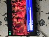
this is what i have got so far
View attachment 18361
kiddac
Newbie
Bigcol. That wont work. The files were all renamed and reworked in version 4. I recommend you upgrade the skin to the latest version. Every release brings in bug fixes and further bonuses and amends. Updating the skin will not effect your settings. The only thing you would have to change again is any personal amends you might have done with extras.xml
Last edited:
XSONY_NGUX
TK Veteran
sometimes my epg graphical view channel listings grey out do you know why this happens?as i said this is what i have so far
but if you want
its in infobar-templates.xml
line 4 and 5
you looking to change the position on both line
now you can place it where you like
enjoy
thanks
Last edited:
siilver
TK Veteran
sometimes my epg graphicsl view channel listings grey out do you know why this happens?as i said this is what i have so far
but if you want
its in infobar-templates.xml
line 4 and 5
you looking to change the position on both line
now you can place it where you like
enjoy
thanks
I'm on atv and I have the same problem, I don't no if it's a slyk skin problem or a universal problem, as it's been so long from I have tired anything or even ran stock skin.
gmanpanthro
TK Veteran
as i said this is what i have so far
but if you want
its in infobar-templates.xml
line 4 and 5
you looking to change the position on both line
now you can place it where you like
enjoy
Managed to shift it with position settings 1080,50

Sent from my iPhone using Tapatalk
XSONY_NGUX
TK Veteran
No worry I try to help
Did you get your icon moved
Yeah i moved it to the top left corner of the screen instead which is looking so much better for me.
I didnt like it above the info bar in the middle of the screen as it looked weird in my opinion.
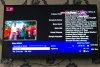
This is how it is now:
Attachments
Last edited:
XSONY_NGUX
TK Veteran
Maybe if you could implement it below the tuner A/B names may be a good idea but then it may be a good idea to decrease the box fields sizes where the listing names are and move the progress bar just before the time.Hmm still looks weird
as its not in the place you are looking at. Info bat is the where you are looking
i might look in to this more but go a different road
Something like this would be amazing but it would be great to still have signal strength and all the other info if possible.

The sky Q skin within this section is great by Chabs as he has put the picon in the info bar so i guess if this was also done for the slyk skin it would make the skin more neat.
Last edited:
XSONY_NGUX
TK Veteran
Yeah true, i hope you manage to get a better layout anyway. Good luck :)It could go any where, but it's finishing it to look good
.jpg")
gmanpanthro
TK Veteran
Sky info bar doesn't have picons. Thats why its wrong where ever you put it. My solution of floating it above the infobar was just to keep people happy that like to show picons. Personally i think its the best option while keeping the infobar as close to the original as possible.
Yeah i was never a fan of the picon in top right corner, as i prefer it where you have always put it. Just thought id find the best coordinates for those that did want it in that corner.
Sent from my iPhone using Tapatalk
siilver
TK Veteran
This morning I started playing with it.
i lowered the picon into bar, just in to the start of the name is, then I have moved the name over. I just need to find the picon background to change it to the same dark blue of the info bar. Then shape it so it looks like it's part of the bar
---------- Post Merged at 10:02 AM ----------
Just thinking I could just edit the info bar background to extend it so the blue backgrounds is part of the info bar
oh idea lol
- Status
- Not open for further replies.
Similar threads
- Locked
- Replies
- 84
- Views
- 3K